Color Influences How You Work
Color isn’t just aesthetic — it’s psychological. Research in environmental psychology shows that the colors in your workspace affect concentration, creativity, mood, and energy levels. Choosing your home office colors with intention can meaningfully improve your workday.
Colors and Their Effects
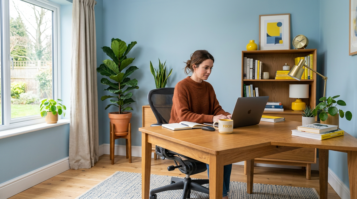
Blue — Focus and Calm
Blue is the most productive color for office environments. It reduces heart rate, lowers stress, and promotes sustained concentration. Ideal for tasks requiring deep focus: writing, coding, analysis, and detailed work.
Best shades: Soft navy, dusty blue, steel blue, or blue-gray Best for: Analysts, writers, programmers, accountants
Green — Balance and Calm
Green combines the calming effects of blue with a restorative quality. It reduces eye fatigue (your eyes require no adjustment to see green), making it ideal for long screen-time workdays. It also evokes nature, which has proven stress-reducing effects.
Best shades: Sage, eucalyptus, olive, or muted forest green Best for: Anyone spending long hours at a screen
Yellow — Creativity and Energy
Yellow stimulates optimism, creativity, and emotional energy. In offices, it’s best used as an accent rather than a wall color — too much yellow can create anxiety. A yellow accent wall, accessories, or artwork adds creative spark.
Best shades: Mustard, goldenrod, or soft butter yellow Best for: Designers, marketers, creative professionals
White — Clarity and Openness
White creates a clean, open feeling that promotes clarity of thought. However, all-white offices can feel sterile and cause eye strain from excessive brightness. Warm whites (with cream or yellow undertones) are more comfortable than stark, cool whites.
Best shades: Warm white, ivory, or soft cream Best for: Minimalists, small spaces needing visual expansion
Gray — Sophistication and Neutrality
Gray provides a sophisticated, distraction-free backdrop. Light grays feel open and modern; darker grays feel enveloping and focused. Warm grays (greige) avoid the cold, institutional feeling of pure gray.
Best shades: Warm gray, greige, or charcoal (accent only) Best for: Corporate work, consulting, executive tasks
Earth Tones — Grounding and Stability
Terracotta, warm brown, clay, and sand tones create a grounding, stable environment. These colors feel warm without being stimulating, making them good for sustained work. They pair beautifully with natural materials and plants.
Best shades: Terra cotta, warm taupe, clay, or sand Best for: Anyone wanting a warm, grounded workspace
Colors to Use Carefully
Red
Red increases heart rate and creates urgency. It can boost short-term energy for physical tasks but causes fatigue over extended exposure. Use red only as a small accent — a desk accessory, a book spine, a piece of art — never as a wall color in an office.
Black
Black is sophisticated but can feel heavy and confining in excess. Use it for accents, furniture frames, or accessories rather than large surfaces.
Bright Orange
Like red, orange is energizing but fatiguing in large doses. A burnt or muted orange accent can add warmth without overwhelm.
Application Strategies
The 80/20 Approach
Paint walls in your chosen productive base color (80%) and introduce energizing accent colors through accessories, art, and textiles (20%). This gives you the sustained benefit of the base color with creative sparks from accents.
Ceiling Color
A white or very light ceiling reflects light and makes the room feel taller. Avoid dark ceiling colors in offices — they can feel oppressive during long work sessions.
Consider Your Lighting
Colors look different under various light sources. Test samples in your actual office conditions. North-facing offices may need warmer colors to compensate for cool light. South-facing offices can handle cooler tones. See how lighting interacts with your overall office design.
Personal Response Matters
Color psychology provides general guidelines, but personal associations matter too. If blue reminds you of a stressful workplace, it won’t calm you regardless of the research. Trust the science but listen to your gut. Choose colors that make you personally feel focused and energized.